> ## Documentation Index
> Fetch the complete documentation index at: https://ui-docs.vibeflow.ai/llms.txt
> Use this file to discover all available pages before exploring further.
# Design Systems
> Bring your own component library to ensure every generated UI matches your brand
Design Systems let you upload and manage reusable component libraries, design tokens, and guidelines. When you select a design system during project creation or in the editor, the AI uses your components and brand guidelines to generate consistent UI.
## What's in a Design System?
A VibeFlow design system includes:
* **Design Guidelines** - Markdown-based documentation covering your brand's principles, colors, typography, spacing, and component usage patterns
* **Component Library** - A curated collection of React components with JSX code
* **Metadata** - Tags, descriptions, and organizational information
## Why Use a Design System?
* **Brand consistency** - Every generated UI uses your colors, fonts, and components
* **Faster iteration** - The AI already knows your design language, so outputs need less refinement
* **Team alignment** - Share a single source of truth for how UIs should look
* **Quality** - Leverage tested, production-ready components instead of generating from scratch
## Creating a Design System
Go to **Design Systems** in the sidebar navigation.
Click **Create Design System** and give it a name and description.
Write your design guidelines in Markdown. Include:
* Color palette (primary, secondary, accent, neutral colors)
* Typography scale (font families, sizes, weights)
* Spacing system (padding, margin, gap values)
* Component patterns (how buttons, cards, inputs should look)
Upload React components with their JSX code. Tag them for easy discovery
(e.g., "button", "card", "nav", "form").
## Using a Design System
### During Project Creation
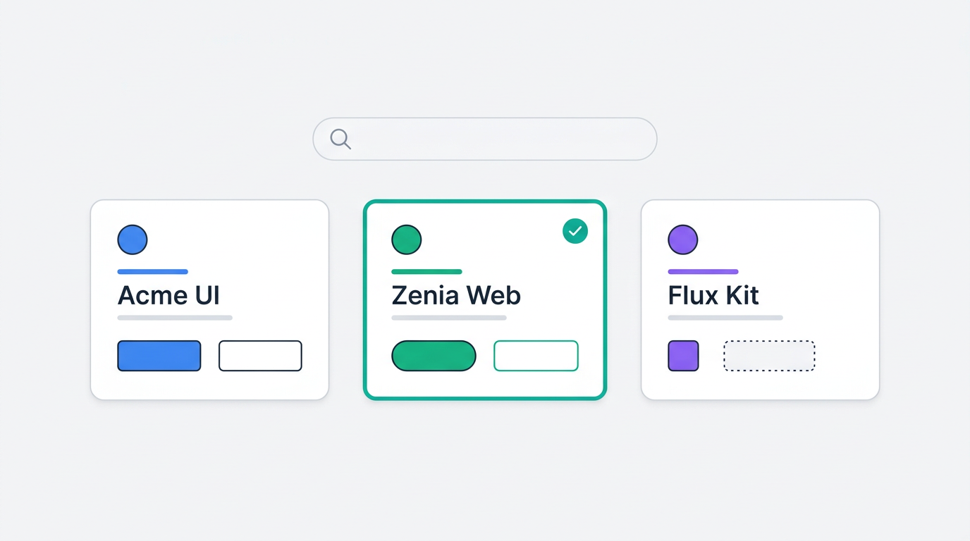
When creating a project from scratch, step 2 shows three visual path cards. Click **Design System** to see your uploaded design systems as cards with preview images. Search by name if you have many, then click to select one.
 ### In the Editor
In the editor, click the **Design System** button in the chat footer. Select a design system from the dropdown. It appears as a context chip in the chat input - the AI will reference it when generating your next change.
## Best Practices
Even a well-written guidelines document (colors, typography, spacing rules) dramatically improves AI output. You don't need a full component library from day one.
Instead of "use blue for primary", write "Primary: #2563EB (Blue 600). Use for CTAs, links, and active states. Hover: #1D4ED8 (Blue 700)."
If your button has primary, secondary, and ghost variants, document each one with its use case. The AI will pick the right variant for the right context.
Define a spacing scale (e.g., 4px, 8px, 12px, 16px, 24px, 32px, 48px) and where each value should be used. This prevents inconsistent spacing in generated UIs.
**Design System + Style in the editor.** During project creation, you choose
one path (style *or* design system *or* start fresh). But in the editor, you
can select both a style and a design system as context chips at the same time
* the AI will respect both.
### In the Editor
In the editor, click the **Design System** button in the chat footer. Select a design system from the dropdown. It appears as a context chip in the chat input - the AI will reference it when generating your next change.
## Best Practices
Even a well-written guidelines document (colors, typography, spacing rules) dramatically improves AI output. You don't need a full component library from day one.
Instead of "use blue for primary", write "Primary: #2563EB (Blue 600). Use for CTAs, links, and active states. Hover: #1D4ED8 (Blue 700)."
If your button has primary, secondary, and ghost variants, document each one with its use case. The AI will pick the right variant for the right context.
Define a spacing scale (e.g., 4px, 8px, 12px, 16px, 24px, 32px, 48px) and where each value should be used. This prevents inconsistent spacing in generated UIs.
**Design System + Style in the editor.** During project creation, you choose
one path (style *or* design system *or* start fresh). But in the editor, you
can select both a style and a design system as context chips at the same time
* the AI will respect both.