UI Styles are curated visual directions that influence how the AI generates your interface. When you select a style, it shapes colors, borders, shadows, spacing, typography, and overall feel.
You can apply a style when creating a new project (step 2) or later from the editor’s Styles dropdown.
Available Styles
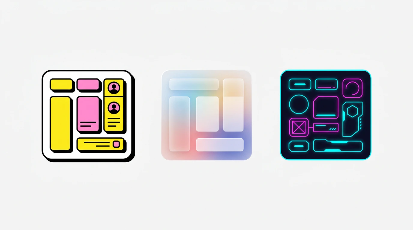
Neobrutalist
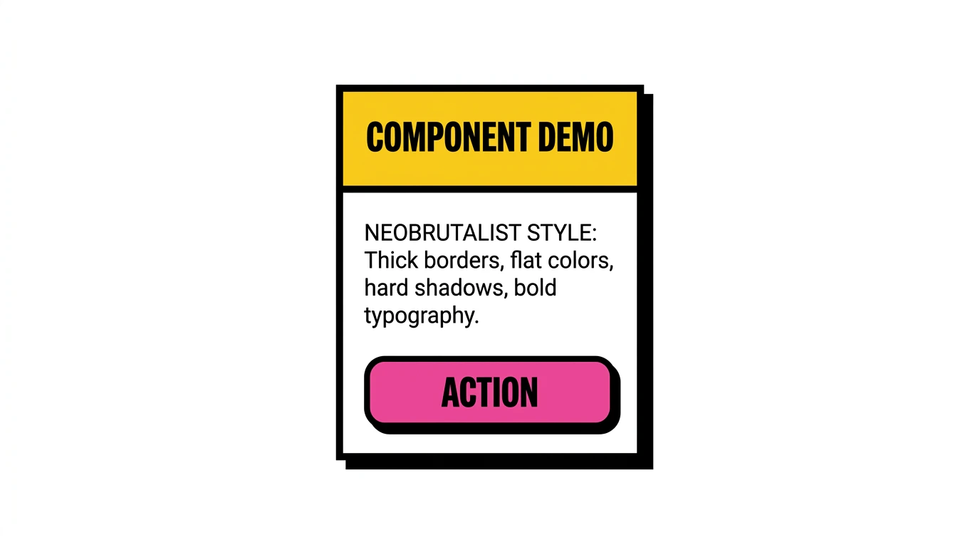 Bold colors, thick borders, raw aesthetic with strong contrasts.
Neobrutalism embraces imperfection. Expect chunky drop shadows, hard borders, high-contrast color palettes, and a raw, hand-crafted feel. Great for portfolios, creative agencies, and brands that want to stand out.
Characteristics: Heavy black borders, offset shadows, saturated primary colors, asymmetric layouts, large bold typography.
Bold colors, thick borders, raw aesthetic with strong contrasts.
Neobrutalism embraces imperfection. Expect chunky drop shadows, hard borders, high-contrast color palettes, and a raw, hand-crafted feel. Great for portfolios, creative agencies, and brands that want to stand out.
Characteristics: Heavy black borders, offset shadows, saturated primary colors, asymmetric layouts, large bold typography.
Flat Design
Clean lines, solid colors, efficient responsiveness.
The digital equivalent of “less is more.” Flat design strips away gradients, textures, and shadows in favor of solid colors and sharp edges. Ideal for dashboards, productivity tools, and business applications.
Characteristics: No shadows or gradients, solid color fills, clean geometric shapes, clear visual hierarchy, icon-driven navigation.
Neumorphism
Subtle shadows, pastel tones, pressed or inset effects.
Neumorphism creates the illusion of elements being extruded from or pressed into the background. It’s soft, tactile, and elegant. Best for music players, control panels, and calculator-style interfaces.
Characteristics: Soft inner and outer shadows, monochromatic color schemes, rounded corners, subtle depth, pastel backgrounds.
Modern Skeuomorphism
Textured elements, depth, tactile cues.
A modern take on real-world textures and materials. Elements feel physical - buttons look pressable, sliders feel draggable. Well-suited for creative tools, audio interfaces, and applications where physicality enhances usability.
Characteristics: Realistic textures, layered depth, glossy highlights, tactile affordances, rich material effects.
Kinetic Typography
Motion-based text effects, slides, pulses, transitions.
Typography takes center stage. Text animates, transforms, and draws attention through movement. Perfect for landing pages, portfolios, and marketing sites where words are the hero.
Characteristics: Animated text entries, scroll-triggered effects, varying font sizes and weights, typographic hierarchy through motion, minimal supporting elements.
Glassmorphism
Frosted glass panels, blur effects, translucent surfaces.
Glass-like transparent layers with backdrop blur create depth and elegance. Elements float above colorful backgrounds, creating a modern, layered aesthetic. Ideal for dashboards, media apps, and premium interfaces.
Characteristics: backdrop-filter: blur(), semi-transparent white backgrounds, subtle borders, colorful gradients behind glass panels, layered depth.
Retro / Y2K
Nostalgic 90s–2000s aesthetics, pixel fonts, CRT vibes.
A throwback to the early internet era. Think pixelated fonts, chunky UI chrome, bright candy colors, and the playful chaos of Web 1.0. Great for games, nostalgia brands, and entertainment sites.
Characteristics: Pixel or bitmap fonts, bright neon and pastel colors, window-style UI frames, retro icons, scanline or CRT effects.
Minimalist
Generous whitespace, muted tones, refined simplicity.
Every element earns its place. Minimalist design uses space itself as a design element, creating calm, focused interfaces. Best for blogs, documentation, premium brands, and content-first applications.
Characteristics: Ample whitespace, limited color palette (often monochrome), thin typography, subtle separators, restrained use of imagery.
Cyberpunk
Neon accents, dark backgrounds, glitch and glow effects.
High-tech meets low-life. Dark backgrounds pulsing with neon glows, glitch effects, and futuristic typography. Perfect for gaming, tech products, and brands with an edgy identity.
Characteristics: Dark base with neon accent colors (cyan, magenta, electric blue), glow effects, monospace or futuristic fonts, angular/asymmetric layouts, scanline overlays.
When to Use Styles
Applying Styles
During Project Creation
When creating a project from scratch, step 2 shows three visual path cards. Click Styles to see a grid of all 9 styles with preview images. Click one to select it, then click Generate UI.
In the Editor
In the editor, click the Styles button in the chat footer (visible for UI-only projects). This opens a dropdown with the same style cards. Selecting a style adds it as context for your next chat message.
Styles are additive, not destructive. Applying a style to an existing
project guides future AI generations - it doesn’t retroactively restyle
existing components. Ask the AI to “restyle the page using Glassmorphism” if
you want to change the existing UI.